
We’ve been listening to your feedback and suggestions and we’ve given Gaydar a fresh coat of paint with loads of improvements. There’s too many to cover in one go so here’s the most useful changes and updates.
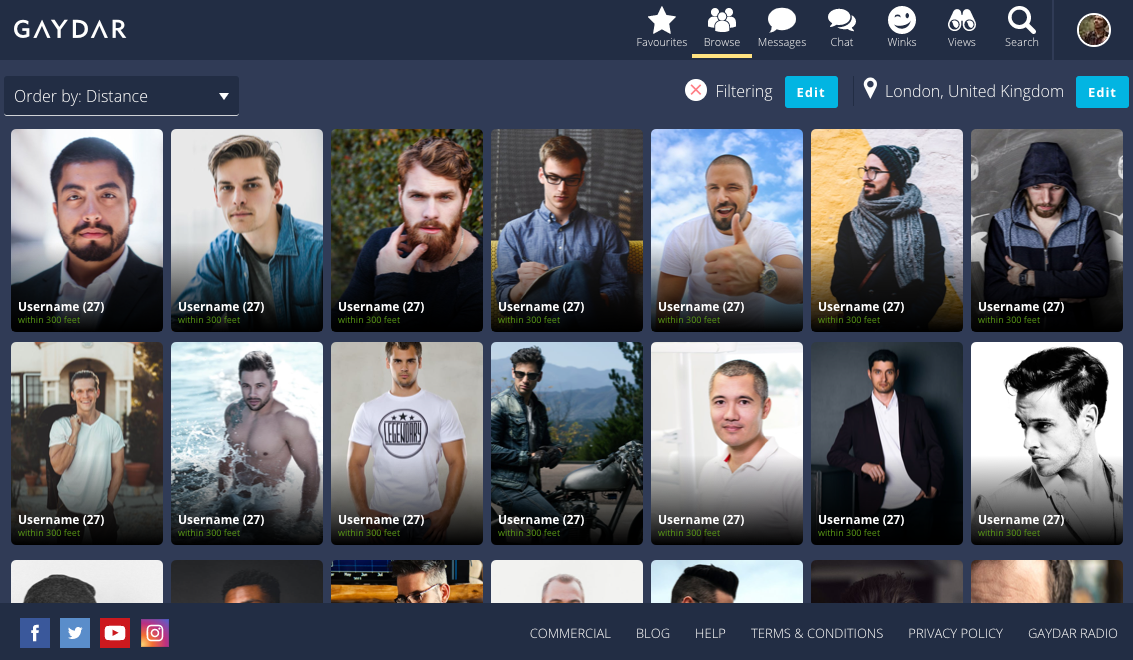
Totally revamped navigation and menu – No more getting lost looking for people or trying to reply to a new message. You’ll always be able to see the most important options to quickly find what you’re looking for.
Improved browsing – You told us viewing profiles was confusing and we’ve listened! Viewing profiles won’t hide our new menus allowing you to take a look at the guys you’re interested in and return to search just where you left it.
Refreshed colours – Everything’s changed! We’ve updated our look so you can easily find the right options for you. Consistent colours to help make updating your profile or finding the perfect guy easy.
As a bonus for those of you using our new iOS app you’ll find everything a lot more familiar.
What’s next might you wonder? We would love to hear from you.
Login now, browse around, and then come back to us with any and all comment you have to make. It is only through the feedback you are willing to give us that we can make improvements.
We hope you enjoy the changes!


The green bar to indicate a person’s on-line has gone. In favourites as well. Are you going to re-instate that?
Hi Chris – there’s now a green dot next to a profile name which tells you if they’re online. 🙂
Well done! it is a lot better. Still,how do I look for someone in a specific town,as I used to be able to do in the old and much missed version of Gaydar? If I want to search in PISA or ROME,how do I narrow down the search and limit ONLY to my requested location? Thanks in advance for your reply. Ciao!!! :-))
Hi Vincenzo, thanks for the comments. 🙂 You can get more specific search options as a PowerSearch user which is a VIP feature.
I wonder if it would be helpful to include in every one’s profile “PREFER MEN AGED FROM xx TO xx” Kind regards.
Hi Jose, I’ll pass this onto our product team to take a look. 🙂
love this datting site
Thanks, at long last GD is much easier to handle..well done guys
I think you misunderstood when people were asking for going back to the orange version in their feedbacks. It wasn’t about a “fresh coat of paint”…
use to enjoy gaydar till you changed to this new system. i dont like the new system and rarely clock in . i wish u would revert back to your old system,jim
Hi Jim, sadly we can’t roll back to the system we have in 2016 as the technology wasn’t supported by modern browsers. If there are some specific things you’d like us to introduce/re-introduce in this new platform, please give us a shout.
Whoever sold this “modern browser lack of compatibility” malarkey is a crook and should be sacked or sued if it was a cowboy contractor ripping the company off and, pretty much, destroying it and its brand. There are three completely separate layers, independent from each other: data, business logic and presentation. Data and business logic reside on the server, and their job is to provide organised content to the presentation layer, and modify the data that is stored. Then it’s the presentation layer which takes care of displaying the data, images and text to the end user. The presentation layer is a website, an app, or even an old fashioned terminal emulator ( monochrome text on black background, no images, like the ones in the 70s ). SQL is the language for databases and it hasn’t really changed in at least the last 20 years. Unless they convinced gaydar to migrate to a NOSQL database – for no reason other than ripping gaydar off – they should have migrated the data too. Destroying it was, I guess, equivalent to criminal damage – but I am not too familiar with legal terminology so cut me some slack here.
Same for the business logic, such as, for example, messaging or uploading / deleting pictures. Nothing had to change in that layer too. Whoever cocked it all up with disappearing messages, messages not being sent, removing the functionality to delete them and so on. The whole concept of modern browsers not supporting the old technology makes no sense either. I have been using Linux since 2002, so we know for sure the old website wasn’t relying on Activex controls or VB Script to work. No browsers I am aware of have difficulty rendering HTML 4, and migrating pages from HTML 4 to HTML 5 is a very minor job anyway. If the old code wasn’t deleted from the version control server ( and, if it was, that’s another very dodgy thing to do ) and there is a back up for the old data, that can be restored in no time and whatever has been added since April 2017 can be normalised and merged to the pre existing one. One of the most shocking things I discovered is that whoever took an axe to botch the new database also wasn’t familiar with the concept of foreign keys, and some records have been dropped despite having references in other tables. For example, there is a profile in my favourites which no longer exists, if I click on it the page keeps on searching for it undefinitely. I am mainly a server side developer, but do website and learning to do apps too. If anybody asked me to alter server side APIs for presentation layers I would give them the same answer a mechaning would give a car owner asking for a new engine because they want to change the colour of their car…
Thanks for the thorough analysis. The site was based on classic asp which isn’t supported these days. 🙂
First reaction was surprise at more tweaks. I thought gaydar was in a better place after previous changes.
It’s useful that Browse is now an option at the top of the page. It’s good that more chat rooms have been restored. Accessing profiles from chat rooms is improved and faster.
However, I find the type used 1) for the basic menu at the top of the page 2) for the last-visit times in Favourites and 3) for Messages timings, all too small and/or thin.
The type continued in Private Chat is dark enough to be user-friendly at a glance – by contrast with the new faint thin type now used in Messages, which is much less helpful. All the types were fine as they were.
It’s useful to be notified at the top of the page how many Favourites are online; but the tiny green dot in the Favourites column to confirm who is online is (again) not easy to access – it almost looks like part of Favourites’ ID. The green line used before was more instantly informative. A larger red dot (for instance) to link with the Favourites alert at the top of the page might be more useful.
When I now access Chat in a pop-up page using Chrome on my laptop, the lower third of the page is filled only with a blank grey band. This isn’t an improvement on the full-page browsing in Chat I’ve enjoyed until now.
I was glad to become a paying gaydar member again when the site settled somewhat into its makeover. Now I hope that further amendments will once more make the site an enjoyable efficient user-friendly forum. Thanks for your attention.
Hi Matt – thanks for your comments. I’ll pass your comments onto the product team, ok?
Once again you’ve screwed up a perfectly good system. With your fantastic new layout I can’t see who is actually online – where has the line under the profile gone??? I think I’m wasting my money!!!¬
Please make the green dot to show that a favourite is online, much bigger and obvious!
Hi David – we’ve had a few requests for this so will get our product team onto it. 🙂
You shouldn’t HAVE to get your product team onto it, it should be thought through and tested before roll out- this is why you are annoying so many members with half baked ideas presented as improvements.
Dear Manager of Gaydar…..just one question…..y….why did you changed the gaydar that I and many others was so fond of for many years…now I dont even know how to get into the new system….or am I in it not seeing all the people >>???
Hi there. The Gaydar platform needed to change, the underlying technology was out of date and wouldn’t work on modern browsers. I can see you’re having issues but we’ll need to get a bit more specific so that we can help you. Can you please give us some details so that we can help? https://cpcconnectltd.kayako.com/
think you’re going in right direction, but in relation to desktop site:
1. wud be good to be able to remove a wink (have easily/accidently chosen this before)
2. as above wud be good to be able to see when user last/if currently online as per Android site (I realise you can see when favourite is online – if that’s what the TINY little green spot is next to profile title!)
2. small thing from a graphic designer’s perfectionist perspective – desktop site widgets (faves, browse etc) bit too close together – why not spread along all the free space to the left or put separators between them
cheers all 😀
Thanks for your comments – I’ll pass them onto the team. 🙂
I agree with Lindsay1955 (Mark) you can no longer see who is actually online – where has the line under the profile gone???
Hi Michael – you should see a green dot instead. 🙂
Yup, another ‘listen to our customers’ improvement and yet it’s even worse than before. Can’t see who is online (not that there are many these days) and a number besides favourites suggests how many are online but no way to see who. Just how many subscribers are you now losing each month as I have not heard anyone say this site is better than to used to be – I certainly have no intention of renewing why pay for something that clearly doesn’t work!
Hi Andrew. Thanks for flagging the issue you’ve had with who’s online. You’ll see we fixed the issue yesterday. 🙂
It’s all fresh, sexy and intuitive, well done, congratulations boys!
But there’s one thing I miss from the old days, before April 2017 that is. Back then, you would receive an incoming message notification tone in your laptop, even if the application had been left open in the background; or an audio plus a visual notification on Gaydar icon on your (i)phone, for that matter. These days, you have no idea if there are any incoming mesages unless you launch the application. Replying timely to messages is kind of important if you know what I mean :-). I can’t imagine why this notification feature regarding incoming messages is still missing. Maybe you could fix it next time, eh?
Keep up the good work, anyway.
Thanks for reading.
Enjoy your weekend
desert.lion (Yannis Delithanasis)
isn’t online indicated by a green dot?
what is the point of knowing i have 7 favourites online if i click on the icon and get every favourite? this was a problem with the last design – it keeps looking better and being less useful
Hi Mike – we issued a fix to the who’s online issue yesterday. I hope it helps.
What was the fix? It would easier if online favourites were grouped at the top of the favourites list so they are the first ones you see.
yup, grouping the online now at the top of the favourites would be such an obvious solution wouldn’t it ? and yet somehow it hadn’t occurred…
Please make the scroll bar in the chatroom list a different colour to dark blue, the background is also dark blue and it is really hard to see it.
I have many favourites carried over from the old site, however the favourites list includes the same profile more than once, making it very long, please can this be sorted into alphabetical order after favourites online?
Hi
Can’t access commercial profiles anymore
Rob – on our website you can access commercial users using the link at the bottom of the page. 🙂
I like the new format, the only thing I did not like was the fact you took away a lot of the specific sexual interest-based chat rooms. I thought perhaps this was to do with tighter UK laws around fetishes and stuff… but you have since brought back rooms for subjects such as Bears, Bondage, Fisting, spanking, daddy/son, domination, group-sex and leather…. so why are there still no rooms for the humble foot fetish or boxers/briefs? (two of the most common and least sordid fetishes going)?
Hey Andy! thanks for your comments. I’ve just asked the team to switch the Foot Fetish and Boxer/Brief chatrooms back on. They should be up tomorrow!
Friends, When I view a page such as this one. To read comments and explanations, this is the time I take, and effort I should at least make out of consideration; please remove the tabloid . recommended for you side of this page; Those items do shall I say, insult me a bit, because they are not why I am on this page. I am on this page provided by the company for their service. I want to have my thoughts geared towards the explanations and instructions from the company, only about it’s products and service which should remain words on a text screen only. No other ideas other than learning. Those type of messages are not inline with what this sites content is about. Secure me for a payment, not the string behind the recommended lead to an outside advert, or be a bad link.
Hi Patrick,
Thanks for the query. I’ll work on this with the team!
Rob
Hi Rob,
We may now have a shiny new looking Gaydar but almost a year on from the launch we sill have many issues with it. Mlost importantly the facilityto block / ignore users within the chatrooms no longer exists. Please can you bring back the block / ignore facility within chat that was promised as part of trhe new Gaydar before the April 2017 launch.
Thank you.
Hi Karl – let me talk to the product team and get this onto the roadmap at some point.
Thanks
Can I only see who has been looking at my profile if I am a paid member?
am I imaginign this or are the chat rooms suddenly gone very quiet … some are permanently empty for eg whats happend to all the South African chat rooms?
Hi Brian, the Gaydar Support team has sent you an email to your registered email address to assist you with your query. They can help with just about anything.
It’s interesting that Dean says the chat rooms have gone quiet. For me they are currently under construction and will return again shortly … it’s been that way for six days now. One of the reasons (and there are many believe me since your revamp) that I will not be renewing my subscription when it is due tomorrow.
Hey Andrew, It seems like your browser is heavily caching the old maintenance page. Press the Ctrl and the F5 key at the same time to do a force refresh, or try clearing the cache in your browser.
Can only scroll down as far as UK Newcastle chat room before the scroll bar on the list of chat rooms starts to hang, cannot see the rest of the rooms.
Hi David, please check you inbox for an email from the Gaydar support team, offering a helping hand and giving you advice.